Email Open Rate
September 13, 2022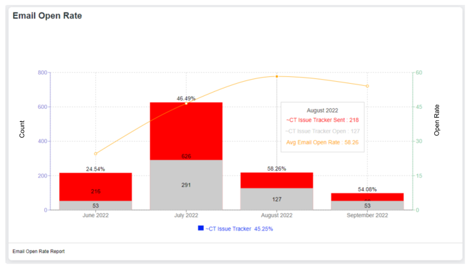
The Chart
An Email Open Rate Chart needs to show 4 things: a Date, Number Sent, Number Opened and the Percentage Opened. We have built all this in one chart. Study the image above.
The dates are shown across the bottom. These dates are sensitive to the date range you set on the Dashboard.
The number sent and opened are measured on the Left Vertical axis.
The open rate is measured against the Right Vertical Axis.
At the bottom center is the total average open rate as calculated for the whole date range.
The Data
Please understand – email open rate is not 100% accurate. However, Email Open Rates provide a good measure of contact engagement over time. The raw data making up the table is provided in the lower left for download. The data is segmented in various ways for self analysis through pivot tables.
Improving Open Rate
Improving email open rate is both a Science and an Art. Much has been written on the subject and is available for you by researching it on the internet. Here are a couple of options:
Verify your email against spam checkers
If you have concerns about your open rate, the first thing everyone should do is check your email against spam filters. One example would be Mailgenius. They will provide you with a temporary (one time use) email address where you can send an email for analysis. Their site will give you a score based on a bunch of factors. Using the titles of those factors you can continue to research each suggestion on the internet. After you have repaired all the suggestions with the email subject and body move on to Server Side improvements
Server Side Improvements
The first step would be to Authenticate our email server or use your own SMTP settings.
A second option for some accounts is having us build a custom email domain setup on our servers.
Check with your Customer Success Manager for more information.